E-commerce Graphics,
a Better Communication Tool Online
January 18, 2021
Doing ecommerce means that the selling process totally relies on the visual and textual content on the website instead of verbal communication and tangible product selection. As a result, the graphic design of your product pages is unprecedently important - It’s the only way that you can optimize the initial communication between you and your customers online.
The graphic design on e-commerce page normally includes:
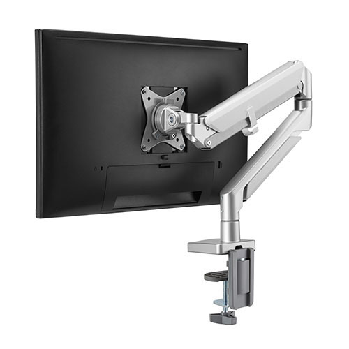
Product Shots
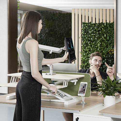
Lifestyle Shots
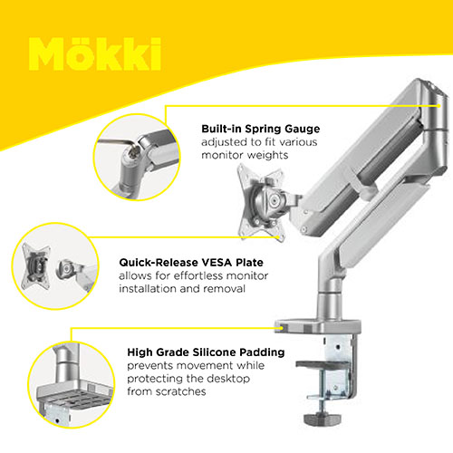
Product Infographics
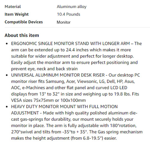
Textual Informationl
However, making an outstanding product page doesn’t mean you fill in the content in the different page sections with texts and images, or you just make the page look better. The good design needs to meet 3 standards for better communication/education:
- 1. Clear Navigation;
- 2. Intuitive USPs Depiction;
- 3. Strong Impression
Let’s take Amazon for example. If there are only product shots and textual information on the left and the right top of the product page , there is a significant deficiency in clear navigation, intuitive USPs depiction and strong impression.
*The horizontal layout and a wall of text isn’t the effective pattern to influence customers’ buying decisions, because there is no well-shaped structure to guide customers to know what you really want your customer to know about, and the USPs cannot be perceived intuitively in this limited space.
According to a large-scale product listing page usability testing conducted by Baymard Institute, 27% of the users overlook the content in horizontal layouts. This phenomenon will undermine the effectiveness of conveying important information.
Also, the content in the horizontal layouts isn’t dictated by the clear structure and hierarchy of the page. Without a clear content structure created by graphic design, the spontaneous viewing patterns determine how users read the content, which means they will randomly skim through the content and easily miss out the important information.
Finally, the content in the horizontal layouts is so limited where you can’t show the USPs vividly, and stop users from leaving an impression on your product.
In short, the content in the horizontal layouts isn’t capable of developing well designed product marketing online. If Amazon is your primary sales channel, we strongly recommend you to add professional A+ content on your page which helps you enhance online shopping experience.
Professional A+ content is different from the “home grown” version which only gather images together. There are 5 core features of creating professional A+ content:
- 1. Clear divisions of different USPs which easily guide customers to have a comprehensive understanding of your product;
- 2. Detailed portrait of different USPs with high-resolution images which is much more intuitive and impressive than textual content;
- 3. Structured viewing patterns allowing customers to focus on the highlights;
- 4. Allowance for vivid and creative elaboration of your product to impress customers;
- 5. More graphic elements are added to enhance the visual effect
Having a well design product page isn’t only about high-quality graphics. It’s also about the right time. The graphic design will add the highest value to your business when your competitors barely have qualified graphics. Business competition is never separate from the competition of time. So, make a quick decision. Start taking your own e-commerce page to the next level.